Summary
- Gary Larson’s The Far Side most often used a single-panel format, in contrast to most other major newspaper comic strips; when The Far Side did employ a multi-panel style, it was in order to maximize the potential of certain jokes that would not have been as effective in a single image.
- Larson’s unique approach to his illustrations was essential to the success of The Far Side, and its continued enduring appeal – though he excelled at delivering jokes in a single image, his occasional use of multiple panels highlighted that he could easily operate in the more traditional format if he wanted to.
- The Far Side’s multi-panel comics allowed for jokes that played action, time, and perspective in more elaborate ways than was often possible in a single panel.
The Far Side is best known for eschewing the traditional multi-panel style of newspaper comic strips, in favor of utilizing a single-panel format – though over the course of the cartoon’s run in syndication, there were plenty of instances in which Gary Larson deviated from his own general “rule,” in order to maximize the potential of a particular joke.
While “rule” might be too rigid for the notoriously all-over-the-place Far Side, Gary Larson’s work came to be defined by its consistent use of just one panel. In other words, The Far Side was largely a comic “strip” in name only; that said, Larson did at times give readers a sequence of images, rather than a solitary illustration.
Thanks to Peanuts creator Charles Schulz, the four-panel comic became standard for the medium; as with his humor itself, Gary Larson displayed his iconoclastic tendencies by subverting this trend, though many of the multi-panel comics he did produce are among his funniest.
2:46
Related
15 Funniest Far Side Comics Starring Its ‘Nerdy Kid’ Recurring Character (Including 2 of Gary Larson’s All Time Best)
Gary Larson’s Far Side didn’t officially use recurring characters, but his repeated use of ‘the Nerdy Kid’ led to some of his best comics.
10
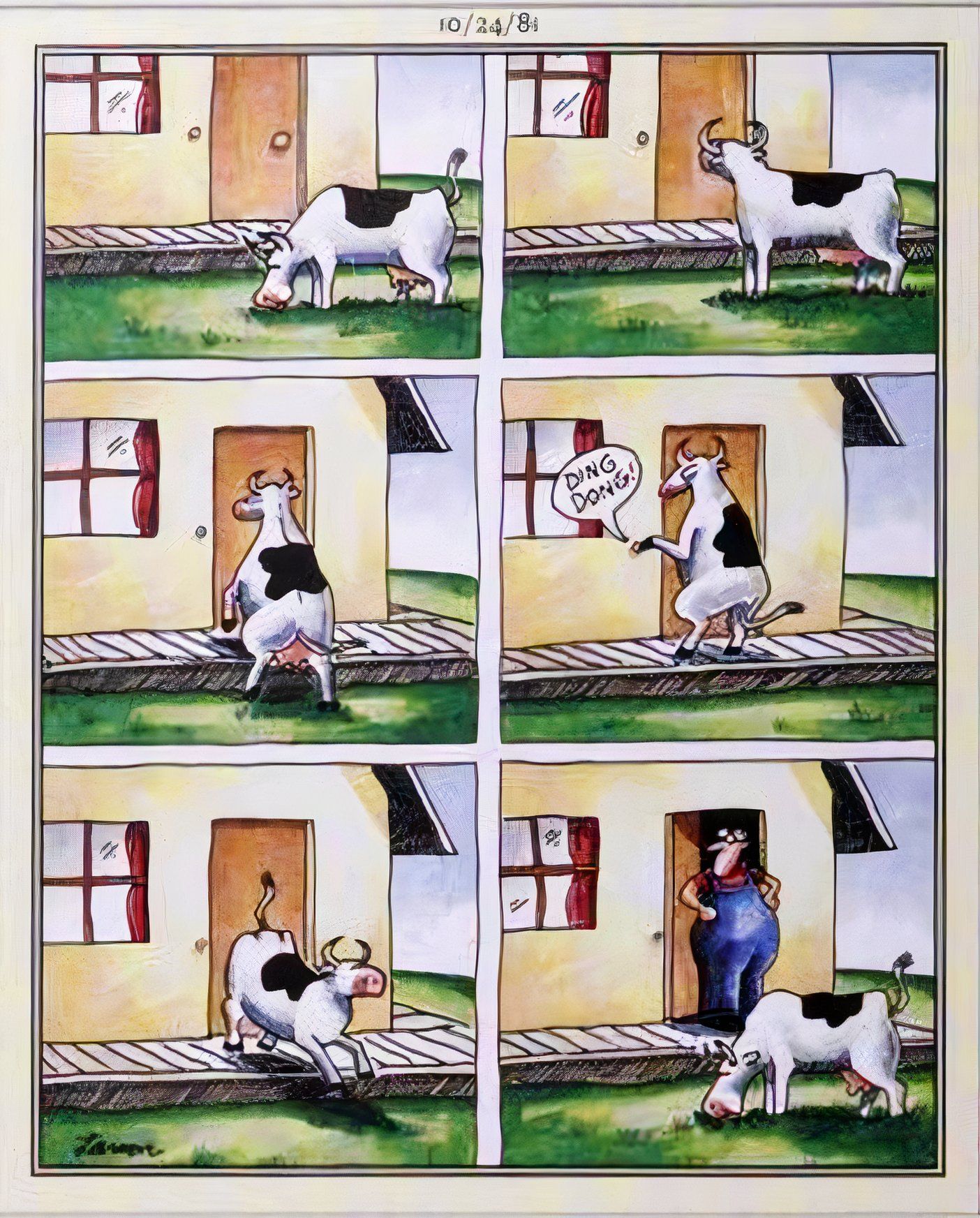
Depicting “Ding-Dong-Ditch” In A Single Panel Would Be Difficult
First Published: October 24, 1981
Whenever Gary Larson opted to employ a multi-panel layout – in place of his signature single-panel style – it was ultimately a result of the decision to prioritize function over form. In other words, if the joke required action, or if Larson wanted to depict a sequence of moments, rather than just one, it became necessary to have more than one panel. That is the case here, as the artist depicts the timeless “ding-dong-ditch” prank.
Of course, because this is The Far Side, the cartoon features a cow pranking its owner by ringing the doorbell and then quickly running back to the front yard to act normal by chewing some grass. While this punchline would have been difficult to convey using a lone image, the series of six images allows the joke to flourish.
9
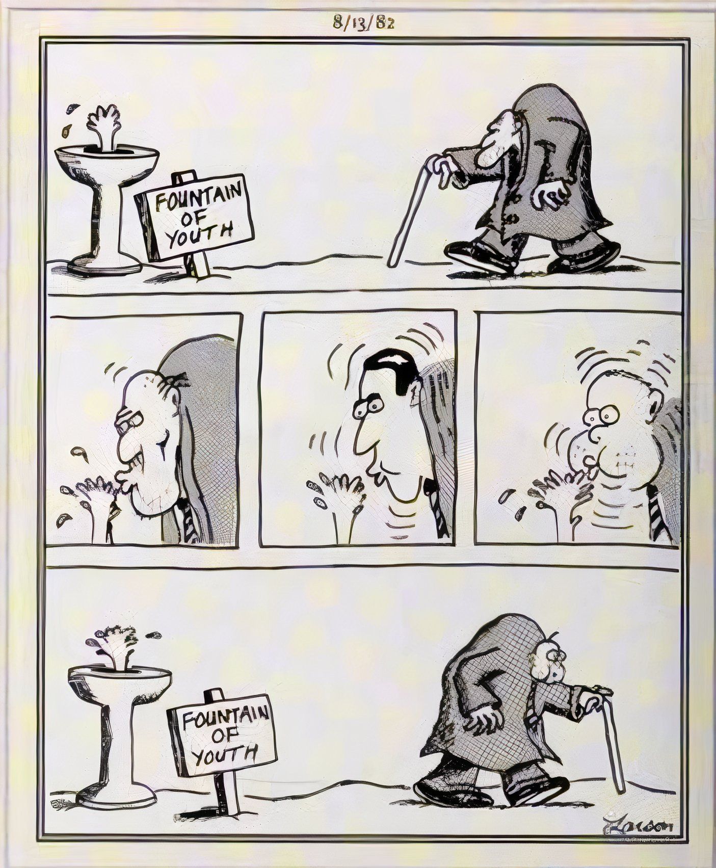
Multiple Panels Allowed The Far Side To Mess With Time (In This Case, Literally)
First Published: August 13, 1982
With The Far Side, Gary Larson showcased an incredible skill for depicting a single moment in time; often, the comic would find the humor in the moment before a character’s impending doom, or immediately after – or otherwise, would focus on one action beat. However, this often left him without the ability to play with the passage of time, something afforded by more traditional multi-panel sequences.
Here, Larson plays with time in more ways than one, as this five-panel cartoon features an elderly man approaching the fountain of youth and drinking from it, only to drink too much, turning him back into an infant. In order to depict the character de-aging, it was necessary for the artist to resort to multiple images, allowing for an entire arc as the old man regresses to his prime, and then goes too far, reverting him once more into a baby.
8
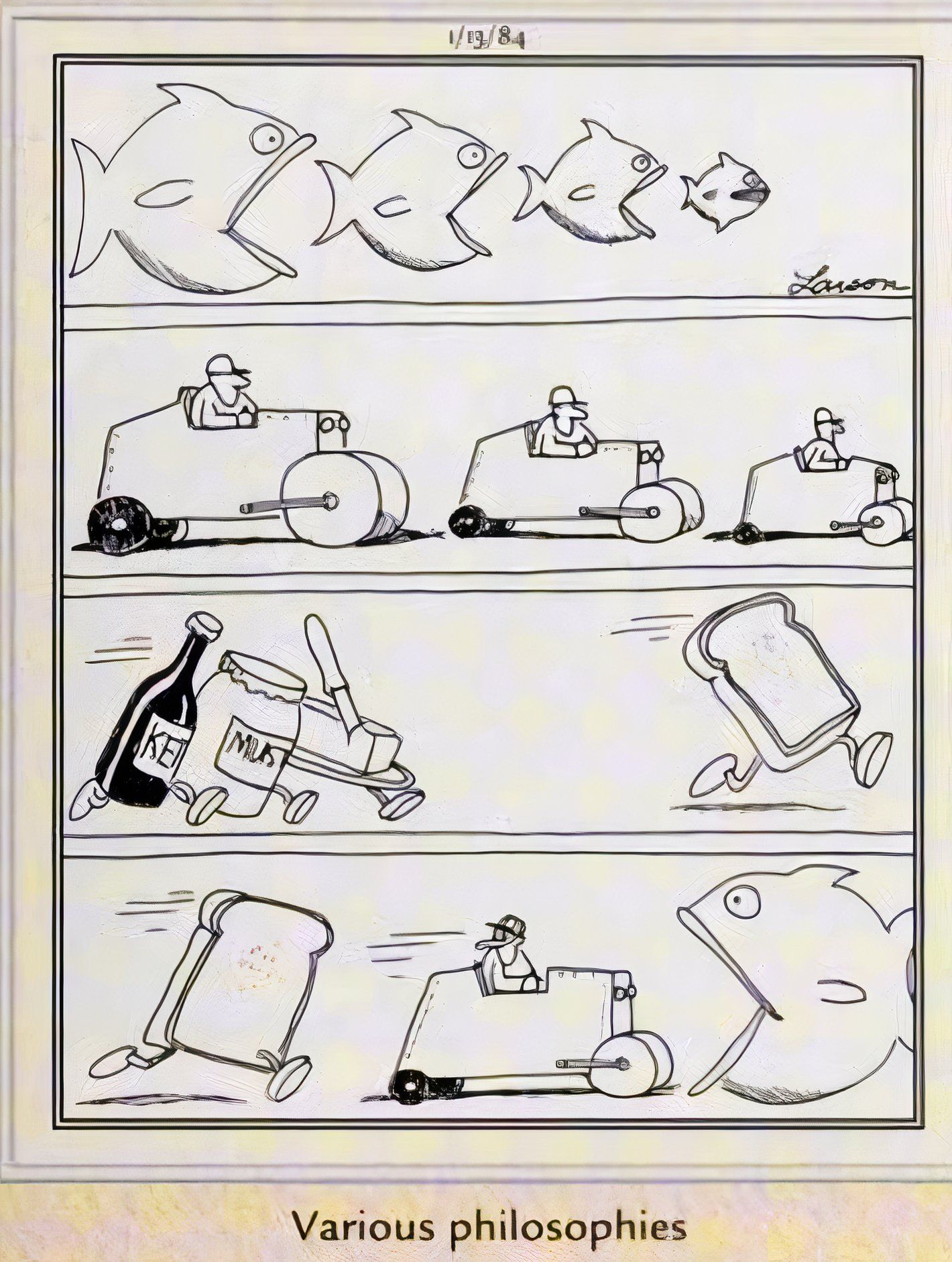
Too Much Absurdity To Contain In A Single Panel
First Published: January 13, 1984
“Confusing, obtuse, esoteric, and strange” are just some of the words that have been used to describe The Far Side – by creator Gary Larson himself. Among readers, it is most regularly described as “absurd,” and this is perhaps one of the comic’s most absurd installments, to the point where Larson needed multiple frames to contain it.
Captioned “various philosophies,” the four panels depict increasingly non-sensical bits of “wisdom”: first, the idea that there is “always a bigger fish,” followed ridiculously by the idea that there is “always another steamroller,” which in turn leads to a group of condiments chasing a piece of toast (perhaps referencing the folk saying about “which side of the bread is buttered,”) and finally, a piece of toast chasing a steamroller into a fish’s mouth. The non-sequitar escalation of the joke makes this, by far, one of Gary Larson’s greatest multi-panel comic strips.
7
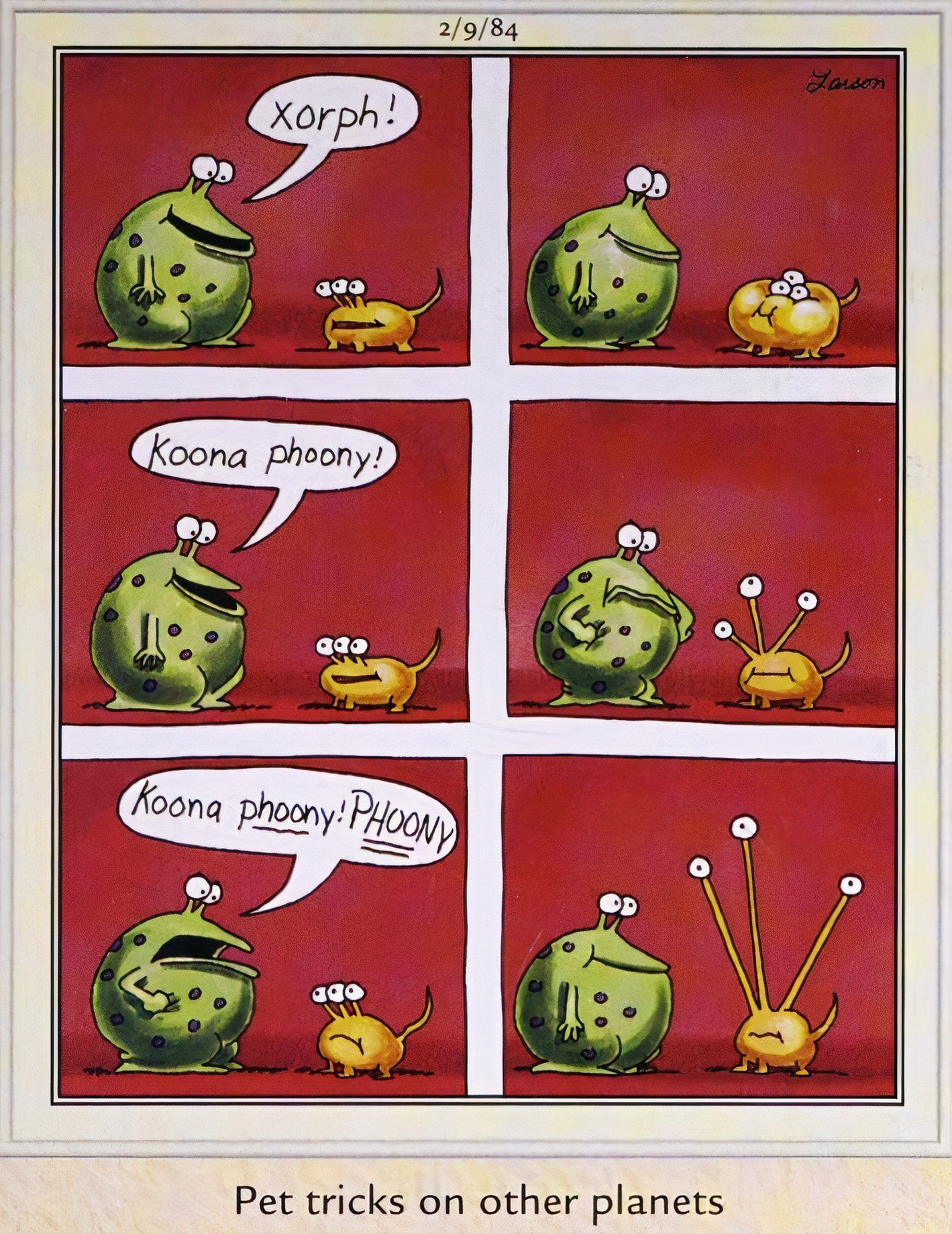
This Far Side Comic Needed Six Panels To Make Zero Sense
First Published: February 9, 1984
By design, this six-panel Far Side comic alienates the reader – literally, casting them as an outside observer as an extraterrestrial speaks to its pet in an indecipherable language. Captioned “pet tricks on other planets,” this has the feel of a single-panel cartoon that artist Gary Larson was simply having too much fun with, prompting its expansion. Though in any case, it is once more a matter of illustrating action and time, as the alien gives successive commands, resulting in successive movements from the pet.
In the successive frames of the illustration, a green alien tells its yellow, three-eyed pet to do tricks it has been taught. When the pet doesn’t do the second trick to the extent its owner wants, the owner grows frustrated, demanding it perform – to which the pet greatly extends its eye-stalks in order to please its master.
6
Multi-Panel Comics Let Gary Larson Expand On His Unique Perspective
First Published: July 23, 1984
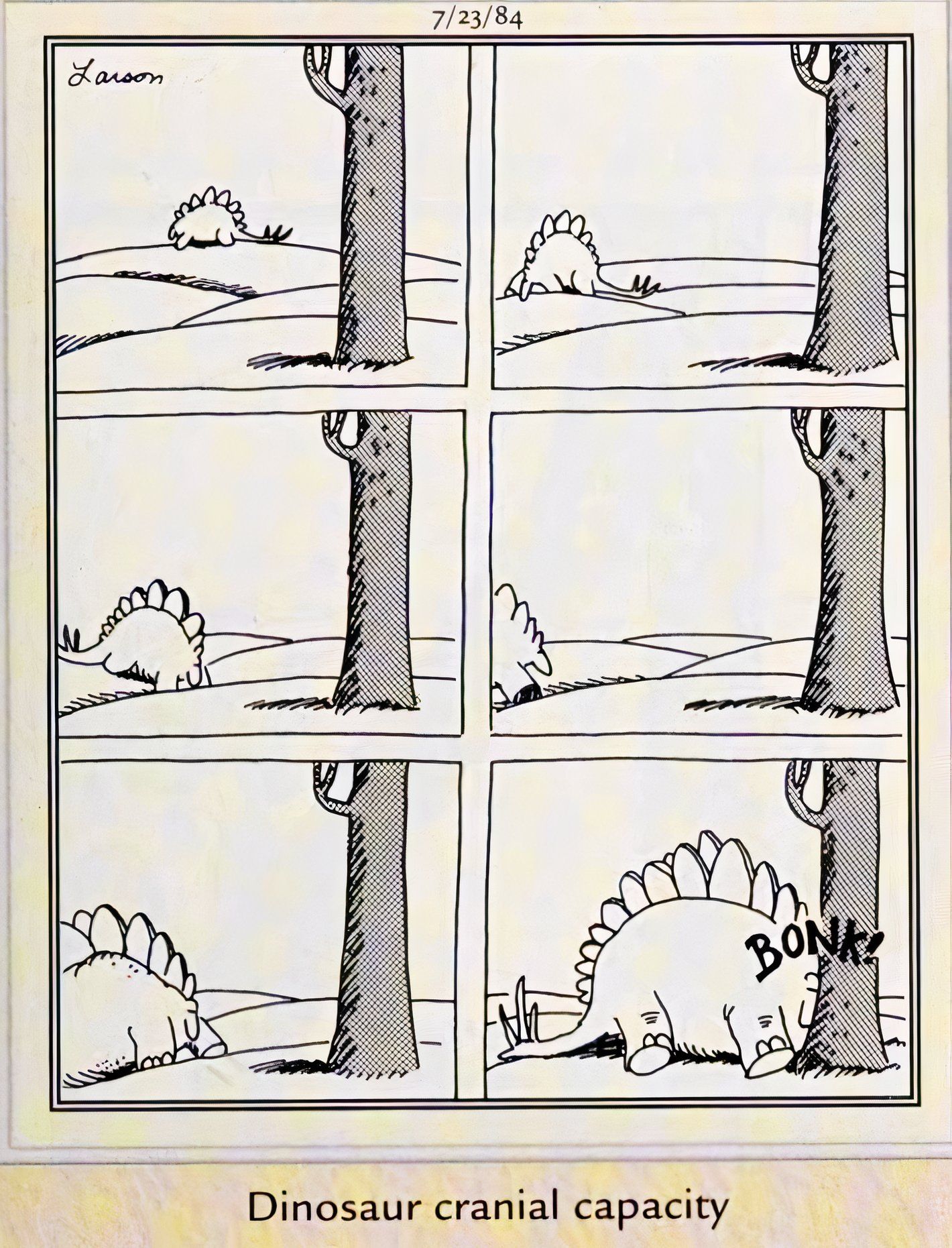
This Far Side comic utilizes multiple panels in order to tell a joke that involves movement and perspective, as a stegosaurus starts off in the distance in the first panel, with a tree placed in the foreground, providing a sense of size and spatial coordinates. Over the course of the remaining five images, the dinosaur steadily lumbers closer – until it bonks its head directly into the tree.
Captioned “dinosaur cranial capacity,” this cartoon’s punchline steadily builds across its six panels, in a way that was rare among Far Side comics. This allowed Gary Larson to flex his creative muscles a bit; while the artist’s idiosyncratic style often found the perfect expression in one panel, Larson’s creative process always involved experimentation, and playing with the multi-panel format was a creative exercise that regularly paid off.

Related
10 Funniest Far Side Comics Where Gary Larson Made Pirates Hilarious
Gary Larson’s The Far Side has a lot of recurring themes, from cowboys to clowns, but pirates are some of its most underrated stars.
5
Gary Larson Made The Most Of The “Split Image” Format
First Published: August 6, 1984
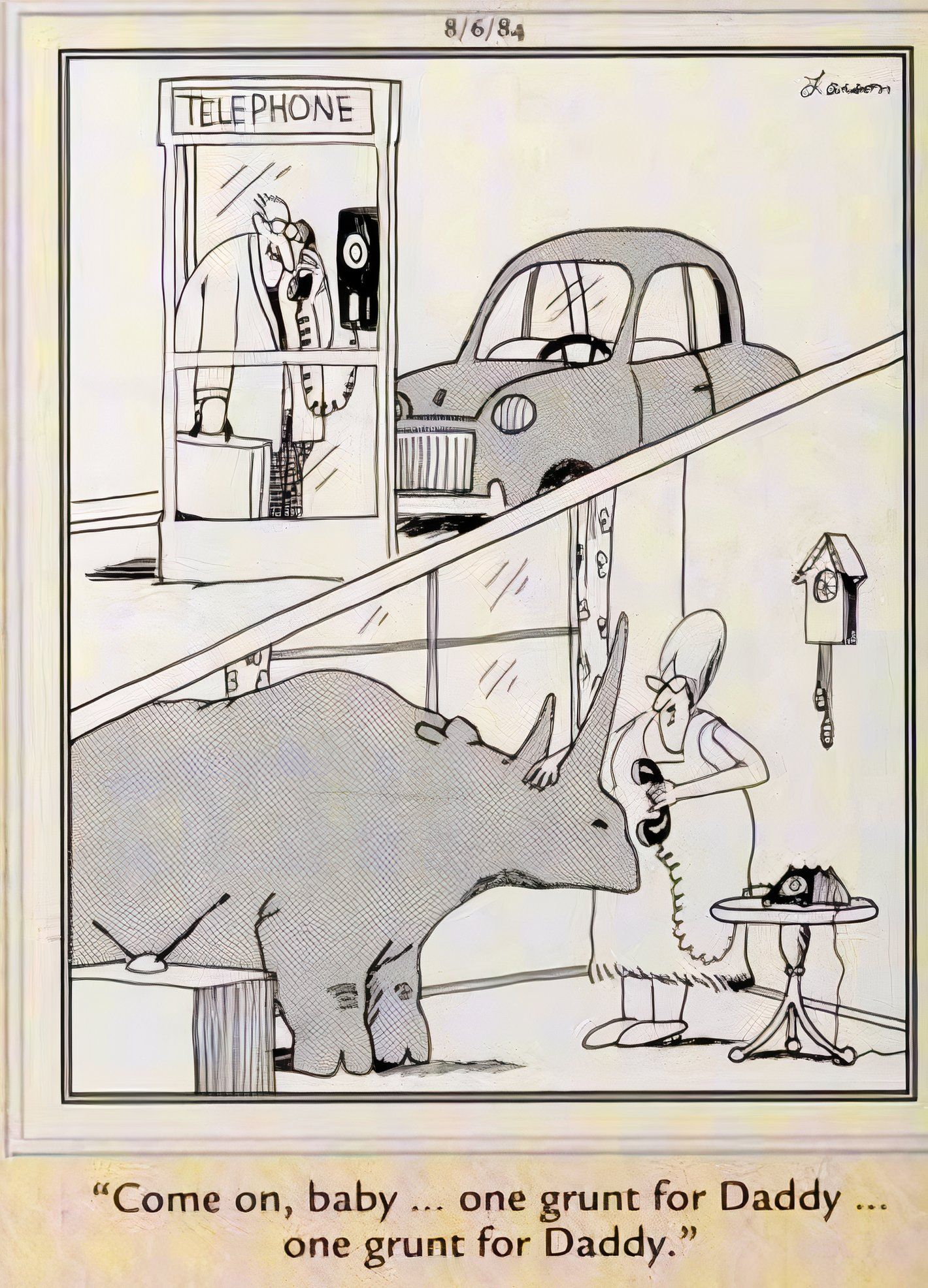
The use of a split-image panel feels like the perfect synthesis of Gary Larson’s usual style and his occasional dalliances with multi-panel cartoons. It allowed him to present a single moment, like many of his best illustrations, while depicting multiple characters in two locations at once, allowing for an exciting dynamic.
This is put to supremely effective use in this particularly bizarre Far Side; the top half of the frame depicts a man in a phone booth, while the bottom half shows who he is calling: his wife, who is putting the receiver to the ear of their pet rhinoceros, pleading with it, “come on, baby…One grunt for Daddy.“ The split-image is perfect here, because it allows for the jarring dissonance between the normalcy of the top image, and the inexplicable inclusion of a rhino as a household pet in the bottom.
4
This Far Side Cartoon Takes The Reader On A Ride
First Published: March 7, 1985
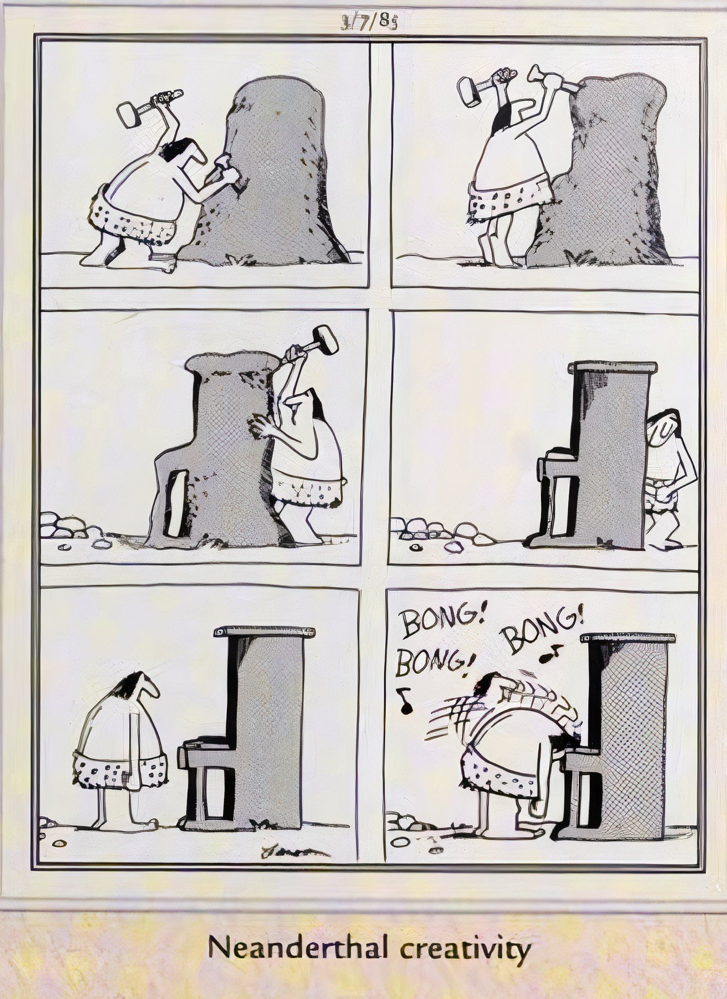
This entry is another contender for “funniest multi-panel Far Side,” as its depiction of a prehistoric individual chiseling a stone into a piano, only to whack the keys with their forehead, is a perfect use of successive images to escalate the joke to an unexpected, but thoroughly hilarious, conclusion.
The sequence builds delightfully, as the first four panels follow the process of the early human shaping a hunk of stone into a seemingly unfamiliar shape, as if guided by some unknown muse. The fifth panel offers a brief pause, as the cave-person looks upon their finished creation. Then, the final panel provides an uproarious punchline, as the artist bonks their head against the instrument, totally unaware of how to play it.
3
Successive Illustrations Offered Gary Larson’s Humor Room To Breathe
First Published: August 10, 1985
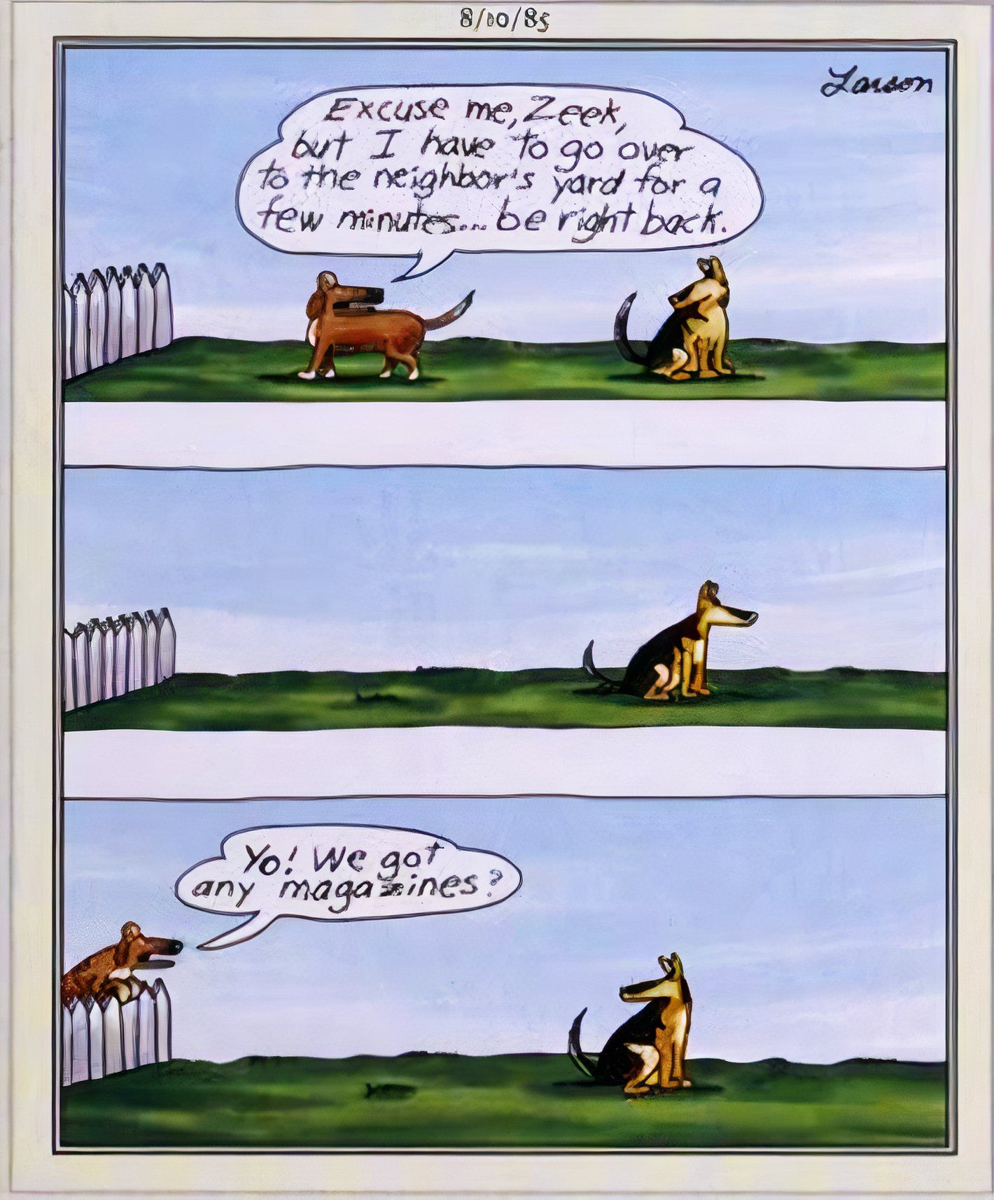
This is a fairly straightforward Far Side cartoon, compared to the heights of absurdity Gary Larson was known to reach; one dog discretely goes one yard over to do its business, there is a pause, and then the dog calls back over the fence to its friend, asking: “Yo! We got any magazines?“
What is particularly worth noting about this strip is that it provides a strong representation of one benefit to multi-panel comics – specifically, the middle panel allows for a beat to occur, offering a brief interlude between the speaking dog’s two lines of dialogue. This is crucial to the success of the punchline, emphasizing that the first dog didn’t realize how long their sojourn was going to take until they got over there.
2
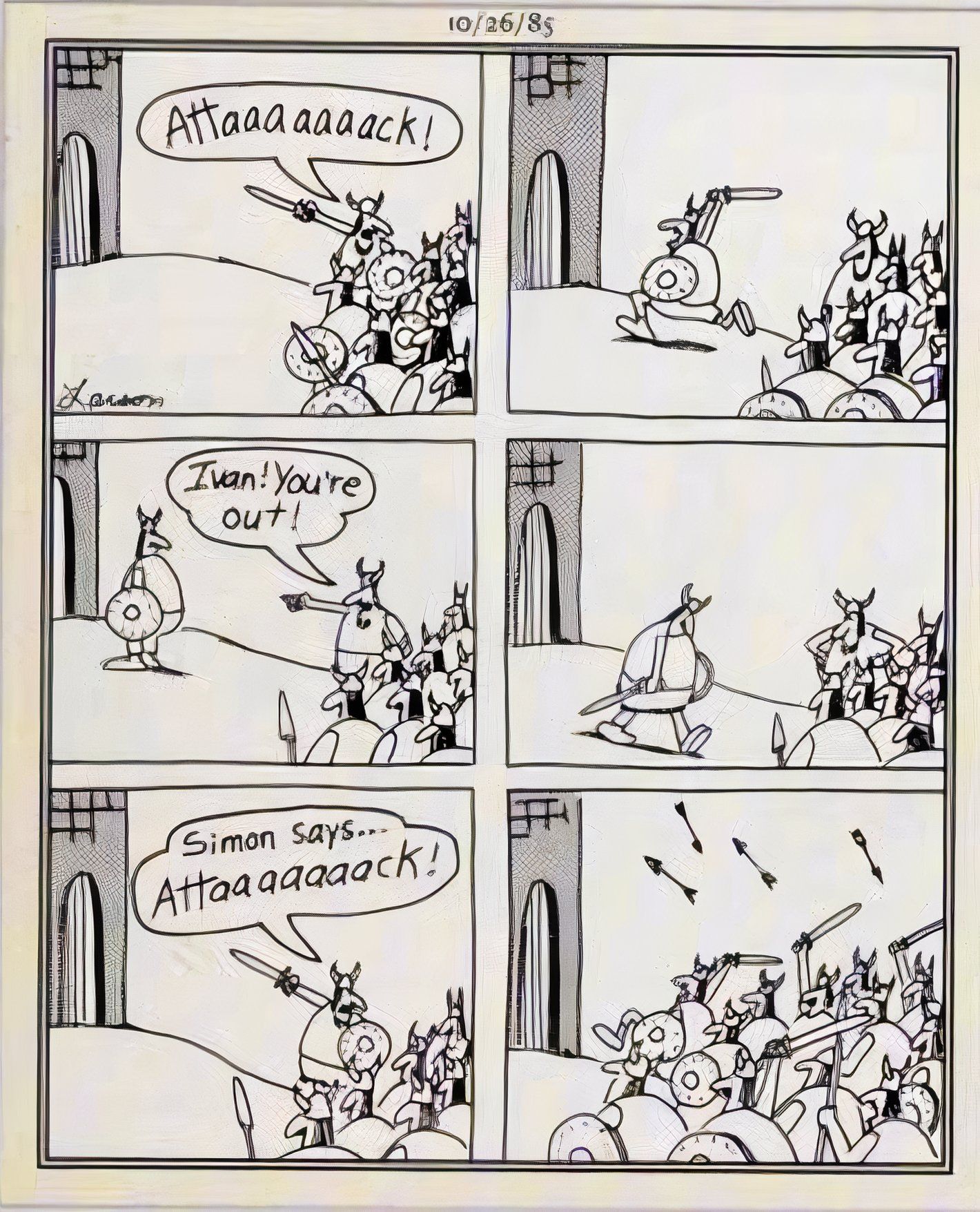
“Simon Says” Wouldn’t Work In A Single Panel Cartoon
First Published: October 26, 1985
Similar to the earlier “ding-dong-ditch” panel, this Far Side depicts a game, one which requires a necessary back-and-forth, which in turn resulted in Gary Larson’s use of a six-panel format. In the first pane;, a Viking raider points his sword at an opposing fortress and shouts, “attaaaaaaack“; in the second, a lone warrior charges forward; in the third, the leader admonishes him, “Ivan, you’re out“; in the fourth, Ivan walks dejectedly away; in the penultimate panel, the leader shouts “Simon says, attaaaaaaack!” and in the final image, the invading horde runs forward, while unleashing a torrent of arrows on their enemy.
Notably, the joke here plays out across each successive panel, with every image offering its own humorous moment, which accrue to full hilarity by the end of the sequence.
1
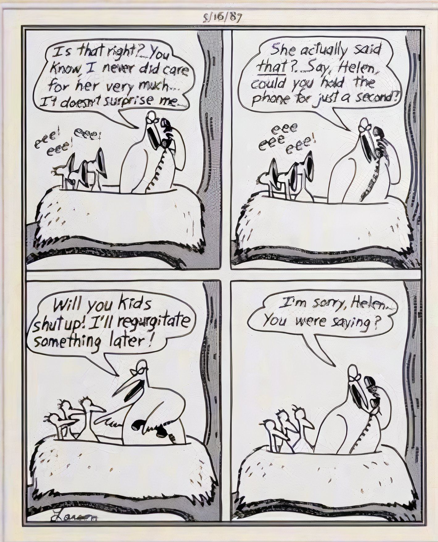
The Four-Panel Format Is For The Birds
First Published: May 16, 1987
Multi-panel Far Side comics appeared in newspapers several times a year during the cartoon’s decade-and-a-half in publication, meaning that as much as his use of a single-panel style can be called a “rule,” Gary Larson fittingly broke from his usual formula whenever it suited him.
In other words, the artist’s rejection of the four-panel format pioneered by Peanuts’ Charles Schulz was not full-on iconoclasm, but rather a dedication to forging his own unique path in the comic industry. That said, this cartoon highlights how effectively Larson was able to employ the four-panel format when he wanted to, as this Far Side hilariously depicts a mother bird telling her kids to to keep quiet, and that she’ll “regurgitate something later,” with the joke resting on the fact that she is on the phone repeating gossip to a friend.

The Far Side Complete Collection
$71 $125 Save
$54
Fans of the far side can’t pass up this master collection of Gary Larson’s finest work. Originally published in hardcover in 2003, this paperback set comes complete with a newly designed slipcase that will look great on any shelf. The Complete Far Side contains every Far Side cartoon ever published, which amounts to over 4,000, plus more than 1,100 that have never before appeared in a book and even some made after Larson retired.
